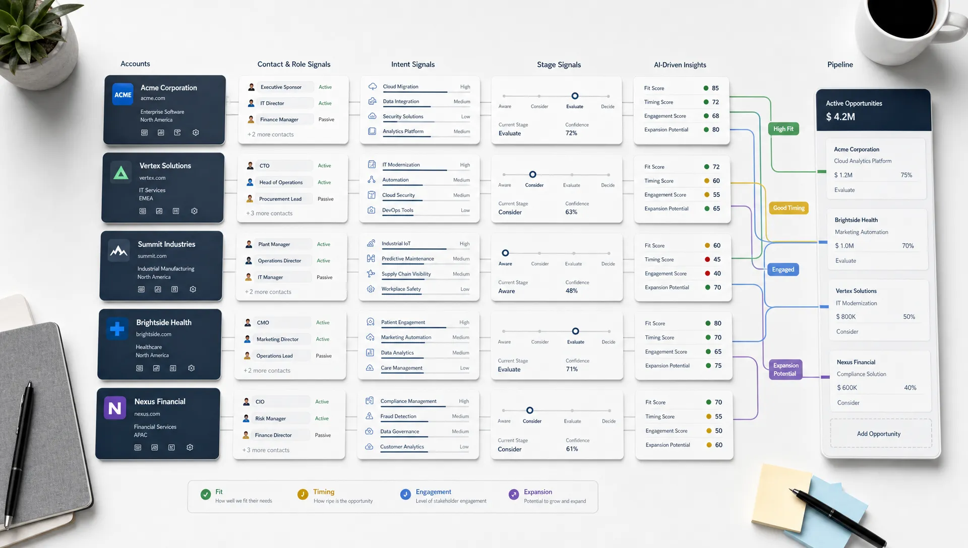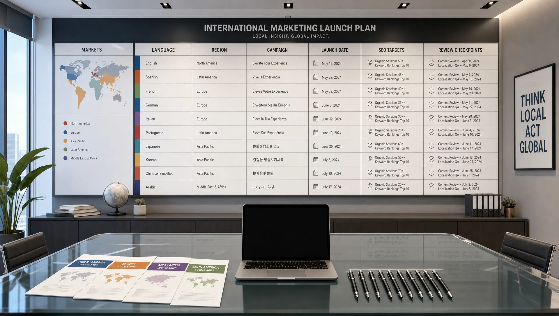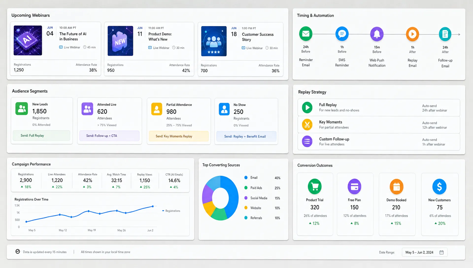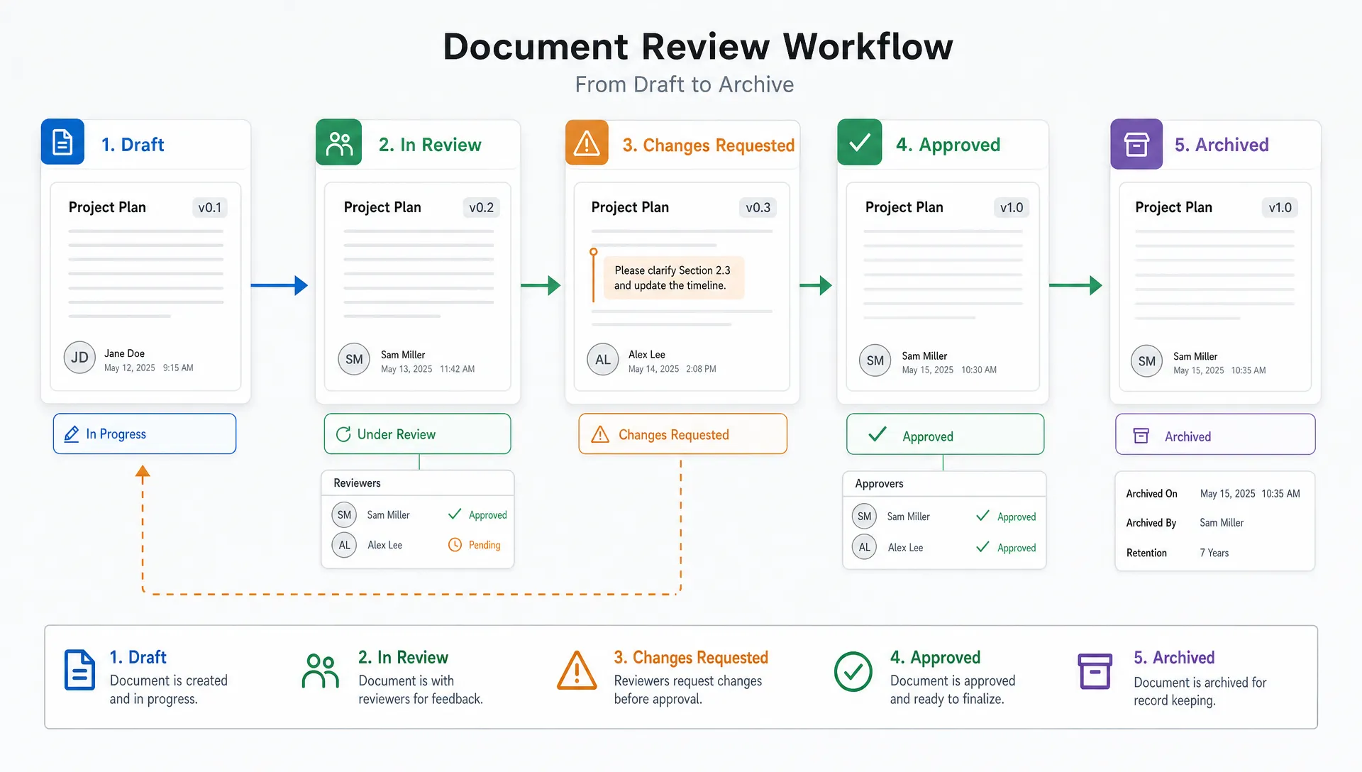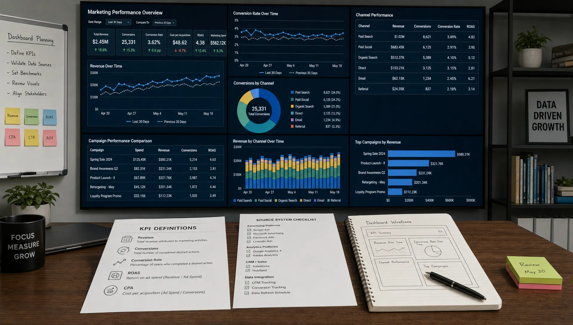
A useful marketing performance dashboard does not start with charts. It starts with decisions. Before you open Looker Studio, Power BI, Tableau or a spreadsheet, you need to know who will use the dashboard, what choices they need to make and which signals separate progress from noise.
When built well, a dashboard becomes the operating layer for your digital marketing strategies. It shows what is working, what is leaking money and where the team should focus next. When built poorly, it becomes a collection of colorful numbers that everyone glances at and nobody trusts.
This guide walks through the full process of creating a marketing performance dashboard from scratch, including KPI selection, data sources, layout, automation, AI-powered analytics and ongoing maintenance.
The first mistake teams make is trying to include everything. A dashboard should not answer every possible marketing question. It should answer a defined set of recurring questions for a defined audience.
A CMO might need to know whether pipeline is growing efficiently. A demand generation manager might need to know which campaigns are converting into sales-qualified opportunities. A content marketer might need to know which articles attract qualified visitors, not just traffic.
Before choosing tools, write one sentence that explains the dashboard’s job:
This dashboard helps [audience] decide [decision] by showing [core signals].
For example, “This dashboard helps the leadership team decide where to allocate marketing budget by showing pipeline contribution, acquisition cost, conversion rates and channel performance.”
That sentence gives you a filter. If a metric does not support the decision, it does not belong in the first version.
Different users need different levels of detail. A founder does not need the same dashboard as an SEO specialist. A sales leader may care about lead quality and pipeline stage velocity, while a paid media manager needs campaign, ad group and creative-level performance.
Create one primary dashboard audience first. You can always build supporting views later, but mixing executive summaries and tactical diagnostics in the same screen usually makes both worse.
Reporting cadence matters too. A daily dashboard should surface fast-changing signals like spend, leads and conversion anomalies. A weekly dashboard can show channel trends, funnel movement and campaign comparisons. A monthly dashboard should connect marketing activity to pipeline, revenue and strategic priorities.
| Dashboard audience | Best cadence | Main purpose | Typical questions |
|---|---|---|---|
| Executive team | Monthly or weekly | Business impact | Are we growing efficiently? Which channels deserve more budget? |
| Marketing leadership | Weekly | Performance management | Where are we above or below target? What needs attention? |
| Channel owners | Daily or weekly | Optimization | Which campaigns, keywords or assets are driving results? |
| Sales and marketing teams | Weekly | Funnel alignment | Are leads qualified? Where do handoffs break down? |
If your team already struggles with metric selection, start with a narrower KPI set and expand later. AIMarketer Hub’s guide to marketing dashboard metrics that matter most can help you separate decision-driving metrics from vanity reporting.
A marketing performance dashboard should reflect how your business actually wins customers. That path may be short, long, self-serve, sales-assisted, event-driven or account-based. The structure of the dashboard should mirror that motion.
For a SaaS company, the funnel might move from website visit to trial signup to activation to paid subscription. For a professional services firm, the journey might move from organic discovery to consultation request to proposal to closed deal. For an ecommerce brand, the path might run from ad click to product view to cart to purchase to repeat order.
A simple funnel map can include:
This map prevents random metric selection. It also reveals missing data. If you cannot connect lead source to closed revenue, your dashboard may still be useful, but it cannot honestly report return on investment until that gap is fixed.
Not every metric deserves the same visual weight. A common dashboard problem is treating KPIs, supporting metrics and diagnostics as equals. That creates confusion because users cannot tell what matters most.
A KPI is a top-level measure of success. A supporting metric explains movement in the KPI. A diagnostic metric helps identify why performance changed.
| Metric type | Role in the dashboard | Example |
|---|---|---|
| KPI | Measures the outcome the team is accountable for | Marketing-sourced pipeline |
| Supporting metric | Explains what influenced the KPI | Qualified lead volume, conversion rate, cost per opportunity |
| Diagnostic metric | Helps investigate performance changes | Landing page bounce rate, keyword performance, form completion rate |
For an executive dashboard, five to eight KPIs are often enough. Channel-specific pages can include more detail, but the top view should stay focused.
Good KPI choices usually connect to revenue, efficiency or customer movement. Examples include marketing-sourced revenue, pipeline created, customer acquisition cost, lead-to-opportunity rate, conversion rate, retention rate and return on ad spend.
Avoid metrics that look impressive but rarely change decisions. Pageviews, impressions and followers can be useful diagnostics, but they should not dominate a performance dashboard unless the business goal is awareness.
A dashboard is only as trustworthy as its definitions. If marketing, sales and finance define “lead” differently, the dashboard will create arguments instead of alignment.
Build a KPI dictionary before building charts. This can be a simple spreadsheet with the metric name, definition, formula, owner, source system, refresh frequency and known limitations.
| Field | What to document | Example |
|---|---|---|
| Metric name | Plain-language label | Marketing qualified leads |
| Definition | What counts and what does not | Leads that meet fit and engagement criteria |
| Formula | Exact calculation | Count of MQL records created in period |
| Source | System of record | CRM |
| Owner | Person accountable for accuracy | Marketing operations manager |
| Refresh | Update schedule | Daily |
| Notes | Caveats or data gaps | Excludes imported event lists before validation |
This step feels administrative, but it saves time later. It also makes marketing workflow automation safer because automations depend on stable definitions.
If you plan to use AI marketing automation, clean definitions matter even more. AI tools can summarize, forecast and flag anomalies, but they cannot reliably fix inconsistent naming conventions or unclear business rules.
Once you know the dashboard’s job and metrics, list every source needed to calculate them. Most marketing dashboards pull from several systems, which may include analytics platforms, ad accounts, CRM data, email software, social media tools, SEO platforms and finance systems.
Typical sources include Google Analytics 4, Google Search Console, Google Ads, Meta Ads, LinkedIn Ads, HubSpot, Salesforce, Mailchimp, Klaviyo, Stripe, Shopify, Semrush, Ahrefs and spreadsheets maintained by the team.
Do not connect every source just because you can. Each source adds complexity, maintenance and potential data quality issues. Start with the minimum set required to answer your dashboard’s core questions.
For many teams, the first version needs only three categories:
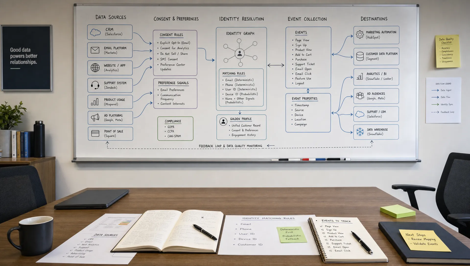
If those systems do not talk to each other yet, the dashboard project may expose a bigger operations need. In that case, the next step may be improving your tracking architecture before polishing the dashboard.
A beautiful dashboard built on messy tracking is still a messy dashboard. Before visualization, check whether your naming conventions, UTM parameters, conversion events and CRM fields are consistent.
UTM governance is especially important. If one campaign uses paid-social, another uses paidsocial and another uses Meta, your channel reporting will fragment. The same problem happens when sales reps use free-text fields instead of standardized values.
Create a simple naming standard for campaign source, medium, campaign, content and term. Then document it where the team can find it. If you use AI content generation for campaigns at scale, include UTM creation in the workflow so every new asset is trackable from the start.
For conversion tracking, confirm that your events represent meaningful actions. A newsletter signup, demo request, pricing page view and completed purchase should not all be treated as equal conversions. Assign them clear names and, where possible, connect them to funnel stages.
The best tool depends on budget, data complexity, team skill and how the dashboard will be used. You do not need an enterprise business intelligence platform for a first dashboard, but you do need a tool the team can maintain.
Looker Studio is common for Google-heavy marketing stacks and lightweight reporting. Power BI and Tableau are stronger for complex modeling and enterprise governance. Native CRM dashboards can work well when pipeline and revenue are the main focus. Spreadsheets are acceptable for a prototype, especially if definitions are still evolving.
| Tool type | Best fit | Watch out for |
|---|---|---|
| Spreadsheet | Prototype or small team dashboard | Manual updates and version control issues |
| Looker Studio | Web, SEO and paid media reporting | Data blending limits in complex models |
| CRM dashboard | Pipeline, lifecycle and sales alignment | Weak visibility into top-of-funnel channels |
| BI platform | Multi-source executive reporting | Setup time, governance and cost |
| Product analytics | SaaS activation and retention | Less useful for non-product funnels |
If you want to compare modern platforms, AIMarketer Hub’s breakdown of the best AI tools for marketing analytics is a helpful next read after you define your requirements.
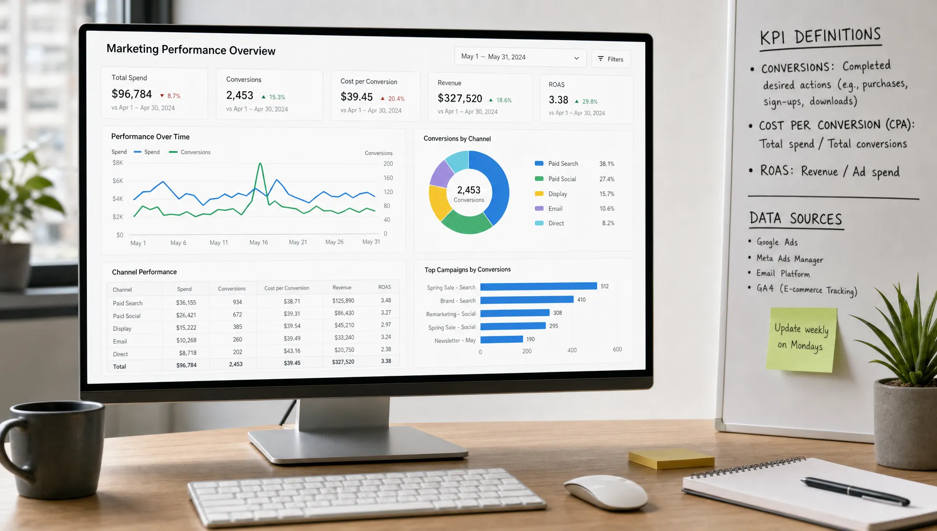
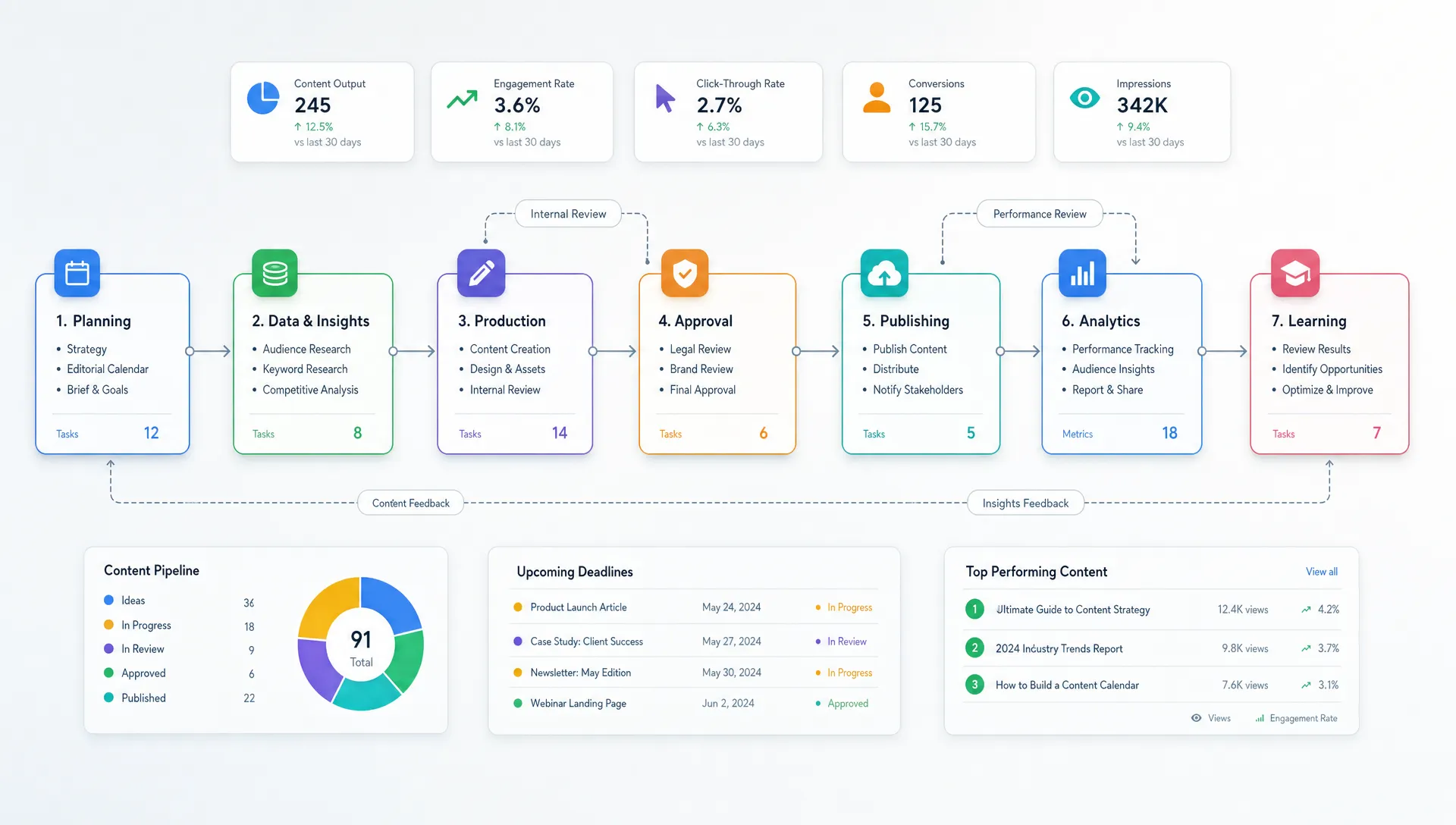
A clear dashboard has a hierarchy. Users should see the overall story first, then drill into causes. Resist the urge to begin with channel-by-channel detail. Start with outcomes.
A practical structure includes an executive summary, funnel performance, channel performance, campaign performance and action notes. Not every dashboard needs every page, but this order usually matches how people make decisions.
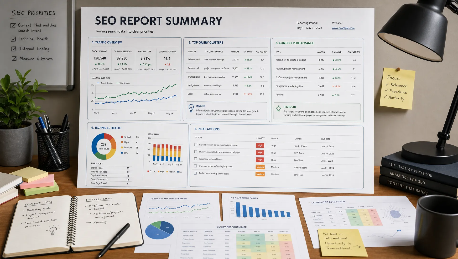
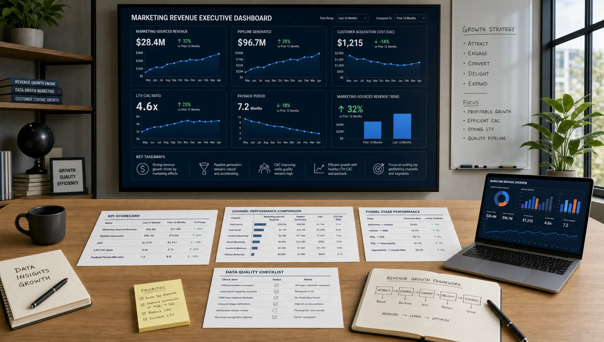
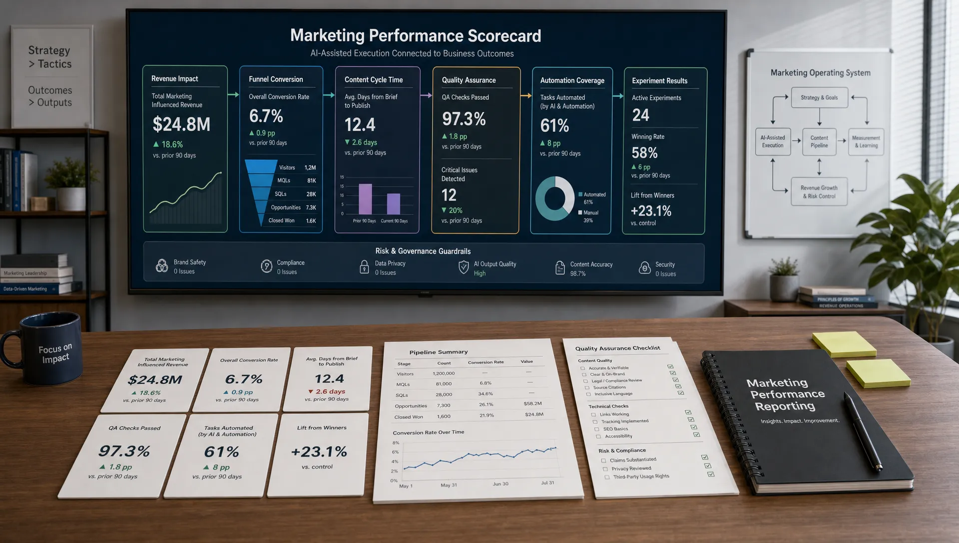
The first section should answer the question, “Are we on track?” Use scorecards for the most important KPIs, then show trend lines and target comparisons.
Include current period, previous period and progress against target. A number without context is easy to misread. For example, 400 leads may be excellent if the target was 300 and poor if the target was 700.
The funnel view shows where prospects move forward and where they drop off. This section should connect stages such as visitors, leads, qualified leads, opportunities and customers.
Use conversion rates between stages, not just raw counts. A rise in leads with a falling lead-to-opportunity rate may mean quality is declining. A drop in demo requests after a website redesign may point to a conversion issue rather than a traffic issue.
The channel view compares sources such as organic search, paid search, paid social, email, referral, partner campaigns and direct traffic. Keep the comparison fair by using metrics tied to the channel’s role.
For example, organic search may perform best on efficient acquisition and assisted conversions, while paid search may perform best on high-intent leads. Email may not drive many first-touch conversions, but it can be critical for nurture and retention.
Campaign views should help marketers decide what to scale, pause or improve. Include spend, traffic, conversions, cost per conversion and downstream quality where available.
For content creation teams, include metrics such as organic entrances, engaged sessions, assisted conversions, newsletter signups, demo assists and pipeline influence. A blog post that generates fewer visits but more qualified leads may be more valuable than a high-traffic article with no business impact.
A dashboard should not only display results. It should capture interpretation. Add a small section for observations, decisions and next actions. This can be manual at first, then partially automated with AI-powered analytics once the data is stable.
Dashboard design is not decoration. It determines how quickly someone can understand performance and act. Use visual hierarchy, consistent colors and plain labels.
Put the most important metrics in the upper-left area for left-to-right readers. Group related metrics together. Use line charts for trends, bar charts for comparisons and tables only when users need detailed lookup.
Avoid pie charts when there are many categories, 3D effects, decorative gauges and inconsistent date ranges. They make dashboards harder to read and easier to misinterpret.
Use color carefully. Green should mean good, red should mean bad and neutral colors should carry most of the visual weight. If every chart is brightly colored, nothing stands out.
A dashboard without targets can tell you what happened, but not whether it was good. Add targets to your scorecards and charts wherever possible.
Targets can come from revenue plans, historical baselines, forecast models, campaign plans or sales capacity. Be transparent about the source. A target based on last quarter’s average is different from a board-approved revenue goal.
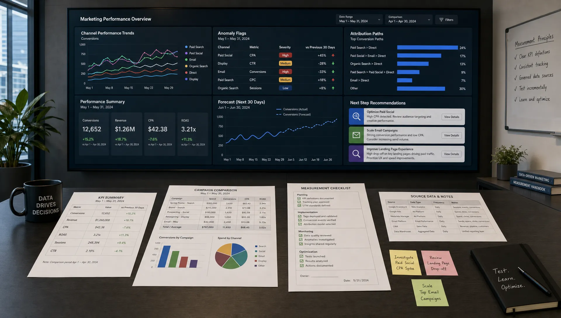
Alerts are useful when a metric changes enough to require attention. Examples include spend pacing above plan, conversion rate dropping below a threshold, organic traffic falling sharply or cost per qualified lead rising beyond the acceptable range.
AI tools can help detect anomalies, especially when the dashboard covers many campaigns or segments. The key is to review alerts for business relevance. A small metric fluctuation may not matter, while a sudden change in qualified pipeline absolutely might.
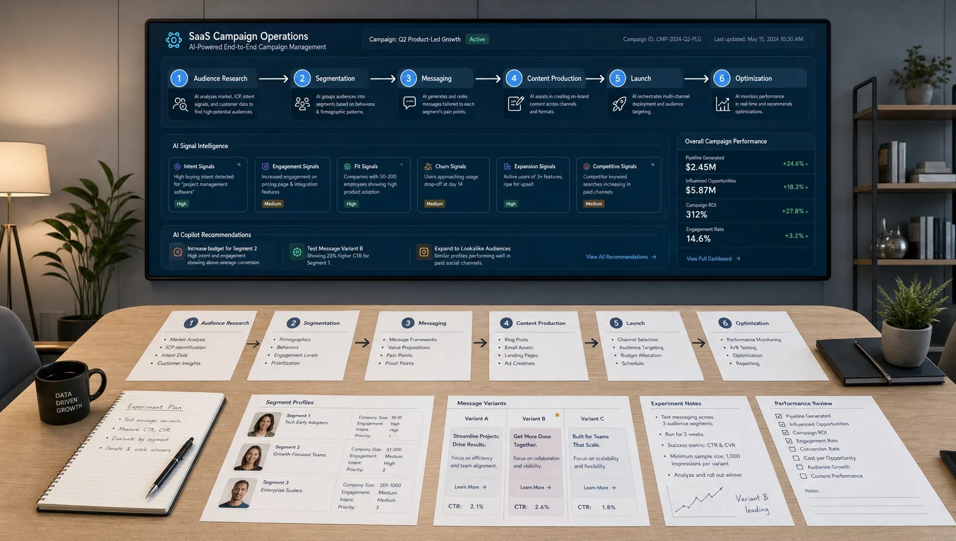
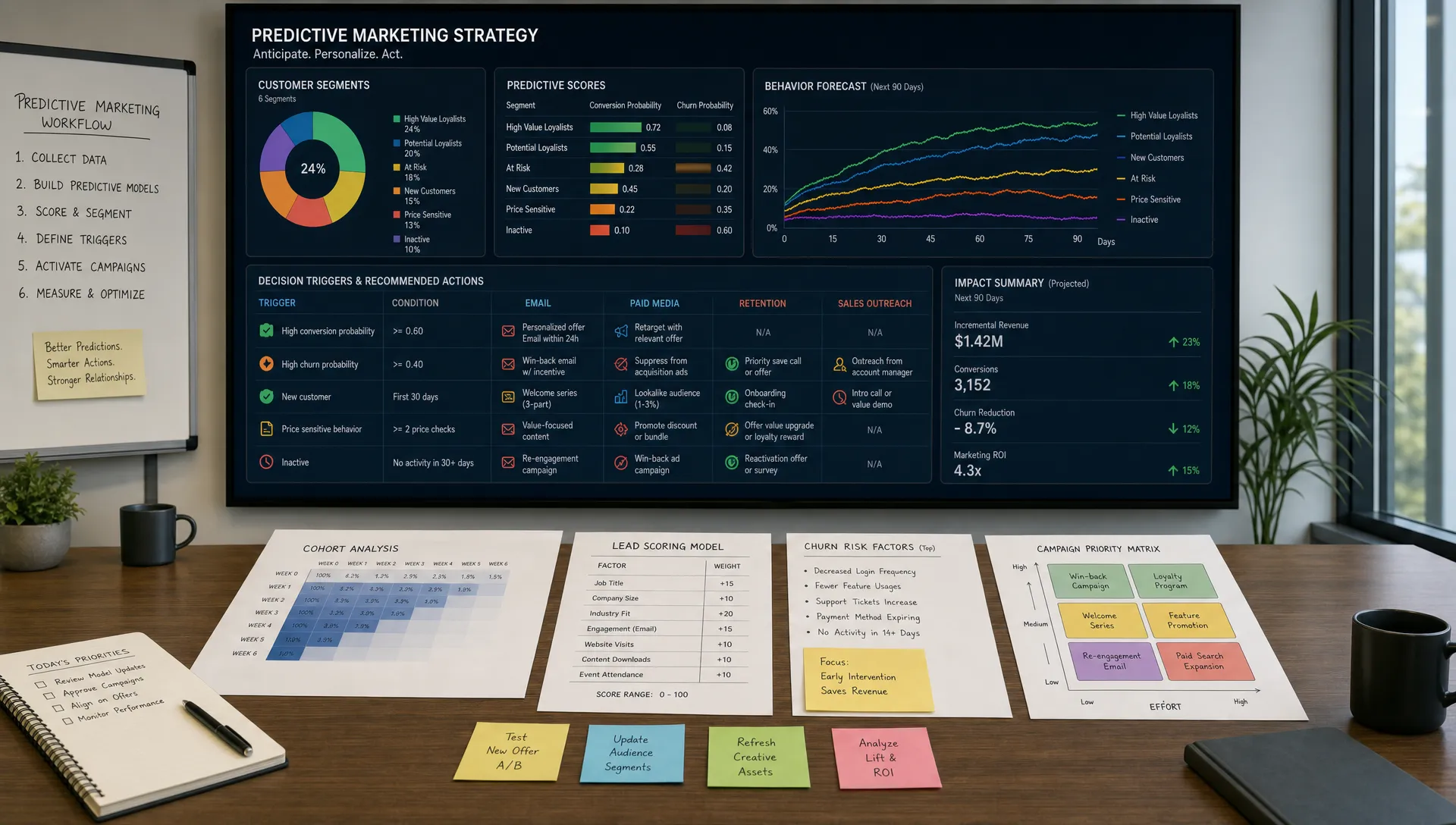
AI marketing can make dashboards more useful by turning raw performance data into faster explanations. For example, AI-powered analytics can summarize weekly changes, identify unusual campaign patterns, cluster underperforming landing pages or generate questions for the team to investigate.
However, AI should not become a layer of confidence over weak data. If your CRM stages are inconsistent or your conversion tracking is broken, AI will simply explain unreliable numbers more fluently.
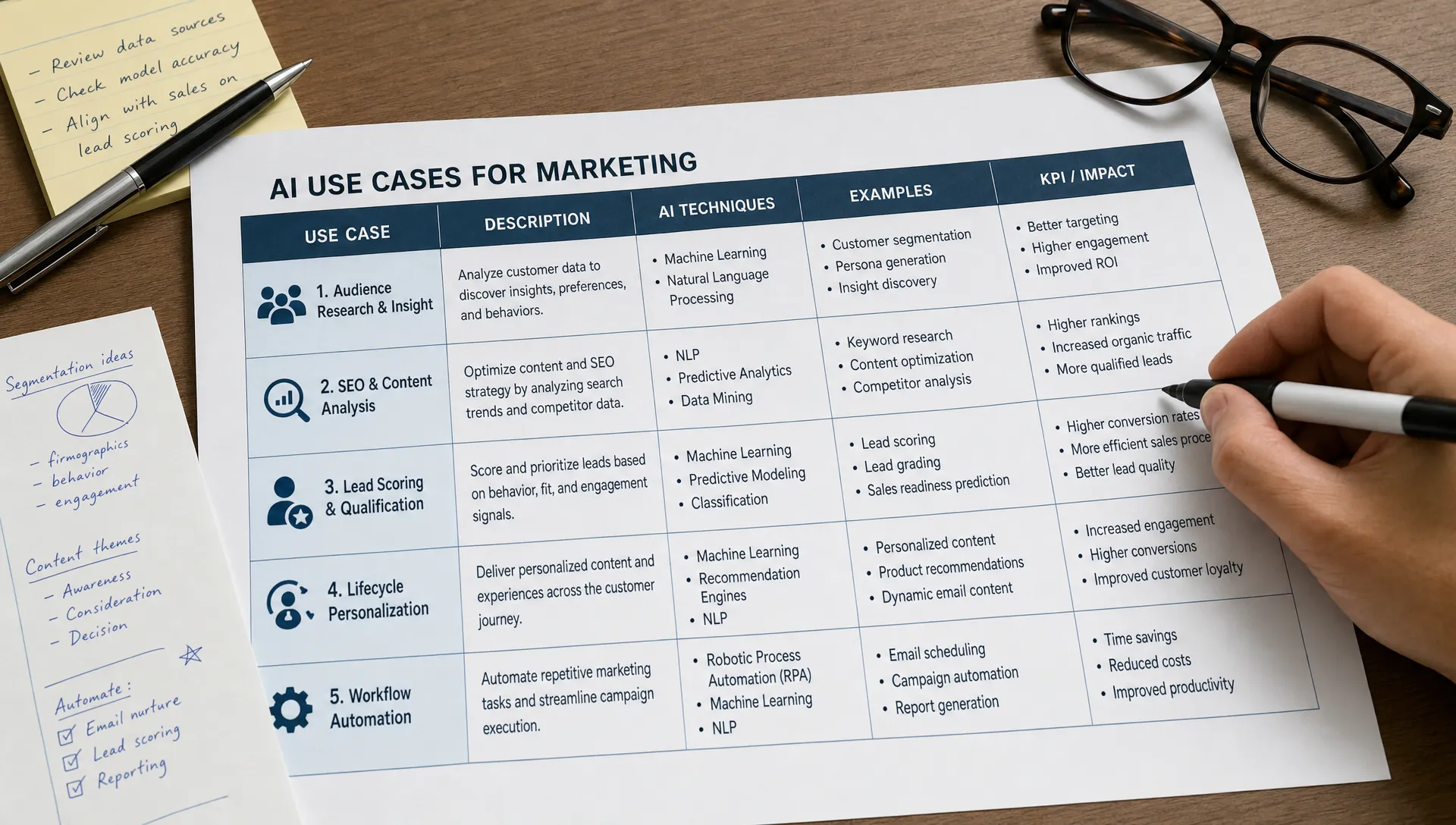
Strong AI dashboard use cases include:
For teams building broader operating systems around reporting, planning and execution, the guide on how to build an AI-powered marketing operations system can help connect your dashboard to repeatable workflows.
The first version of your dashboard should be useful, not perfect. Aim for a minimum viable dashboard that answers the most important questions with trustworthy data.
A good first version might include one date filter, one executive summary page, one funnel page and one channel page. Add more views only after users confirm that the foundation is accurate.
Here is a practical first-build sequence:
This approach is faster than trying to build a complete analytics environment in one pass. It also gives stakeholders something concrete to critique.
Dashboard QA is not optional. A small formula error can change budget decisions, hiring plans and leadership confidence.
Validate totals against source systems. Check date ranges, filters, attribution settings, currency formats, timezone settings and duplicate records. Compare dashboard numbers to known reports from finance, sales and ad platforms.
Ask metric owners to review the numbers they are accountable for. If the CRM owner does not trust the opportunity count, fix that before launch. If the paid media manager cannot reconcile spend, do not present the dashboard as final.
Create a short QA checklist and repeat it whenever you add a new source, metric or transformation.
| QA check | Why it matters |
|---|---|
| Date ranges match across sources | Prevents misleading period comparisons |
| Filters are clearly labeled | Reduces accidental misreading |
| Totals match source reports | Builds trust in the dashboard |
| Definitions match KPI dictionary | Prevents cross-team disputes |
| Data refresh time is visible | Helps users know how current the report is |
| Owner is assigned | Makes maintenance accountable |
A dashboard creates value only when it changes behavior. If nobody uses it in planning, budget reviews or weekly standups, it is just a reporting artifact.
Decide when the dashboard will be reviewed and what decisions it will support. For example, a weekly growth meeting might use the dashboard to identify one channel to scale, one conversion problem to fix and one experiment to stop.
Assign an owner for maintenance. This person does not need to own every data source, but they should own dashboard quality, stakeholder feedback and version control.
As the dashboard matures, remove unused charts. Many dashboards become bloated because teams keep adding requests without pruning old views. Review usage quarterly and ask, “Which charts changed a decision?”
The same dashboard framework can apply across industries, but the metrics should match the business model. A B2B SaaS company, ecommerce store and premium service provider should not evaluate marketing performance in the same way.
For example, a premium business transportation provider such as Stuur Chauffeurs would likely care less about raw traffic volume and more about qualified corporate inquiries, executive travel requests, event transportation leads, response time and booking value. That is a different dashboard than a self-serve software company tracking trial activation and product usage.
| Business model | Primary dashboard focus | Example KPIs |
|---|---|---|
| B2B SaaS | Pipeline quality and lifecycle movement | Trials, activations, qualified pipeline, CAC |
| Ecommerce | Sales efficiency and repeat purchase behavior | Revenue, conversion rate, AOV, repeat purchase rate |
| Professional services | Lead quality and deal progression | Consultation requests, proposal rate, close rate |
| Local service business | Demand, availability and booking value | Qualified calls, booked jobs, cost per booking |
| Media or content brand | Audience growth and monetization | Engaged sessions, subscribers, ad revenue |
This is why dashboard templates can only take you so far. The layout may be reusable, but the meaning of performance depends on your revenue model.
The most common dashboard mistakes are not technical. They are strategic. Teams often start with too many metrics, skip definitions or design for reporting instead of decisions.
Another mistake is blending incompatible attribution views. First-touch, last-touch and multi-touch attribution can all be useful, but they should not be mixed without labels. If one chart credits revenue to the first source and another credits it to the last source, users will draw the wrong conclusions.
Do not overbuild the first version. A complex dashboard with unclear definitions is less useful than a simple dashboard everyone trusts. Also avoid hiding important caveats. If offline conversions are missing or revenue data updates weekly, say so directly in the dashboard.
Finally, do not use AI-generated insights without human review. AI can accelerate analysis, but marketing leaders still need to understand the context behind campaigns, sales cycles, seasonality and strategic bets.
What is a marketing performance dashboard? A marketing performance dashboard is a reporting view that brings key marketing metrics into one place so teams can monitor progress, diagnose issues and make better decisions.
What should a marketing performance dashboard include? It should include the KPIs tied to your business goals, supporting funnel metrics, channel performance, campaign results, targets, date filters and notes that explain changes or decisions.
Can I create a dashboard without a BI tool? Yes. A spreadsheet can work for a first version if your data sources are limited and you need to clarify definitions. As reporting needs grow, a dashboard tool or BI platform usually becomes easier to maintain.
How often should I update a marketing dashboard? Daily updates are useful for spend and operational monitoring. Weekly updates are better for team decisions. Monthly views are best for leadership reporting and strategic planning.
How can AI help with marketing dashboards? AI can summarize trends, detect anomalies, draft performance narratives and suggest follow-up questions. It works best when your data sources, naming conventions and KPI definitions are already clean.
Creating a marketing performance dashboard from scratch is not about adding more charts. It is about creating a shared view of performance that supports better decisions.
Start with the decision, define the audience, map the funnel, document KPIs, clean the data and build a focused first version. Once the foundation is trusted, you can add AI-powered analytics, automation and deeper diagnostic views.
AIMarketer Hub helps marketers turn scattered data and ideas into practical systems with AI marketing resources, marketing guides, SEO tools, calculators and workflow support. Use your dashboard as the measurement layer, then keep improving the campaigns, content and operations behind the numbers.